Brand kit
Logo files, the one accent color and the rules for writing the name.
Logo
The crystal Inu is our mark. Use the cut out on dark backgrounds, and the square files where a platform needs an avatar.
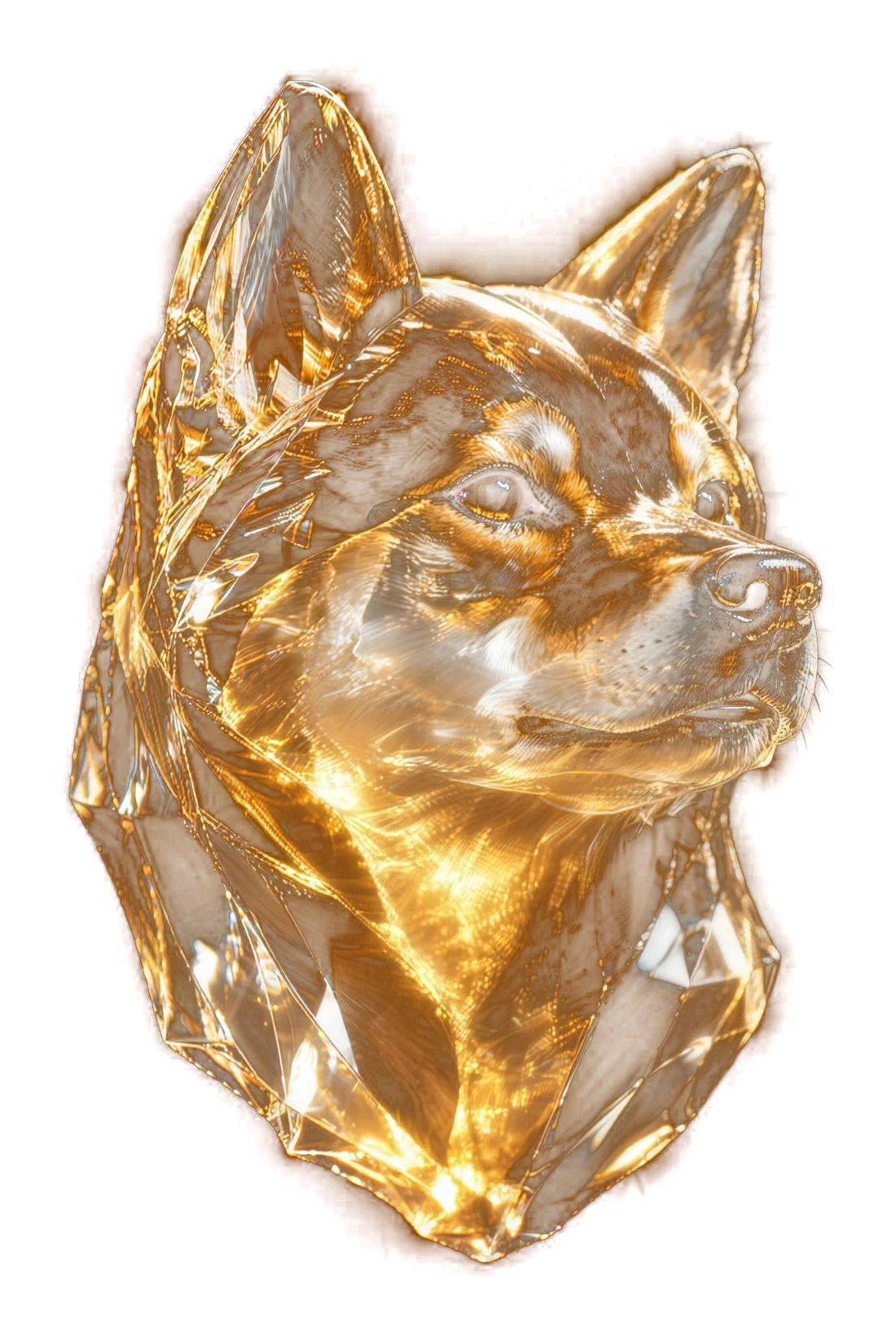
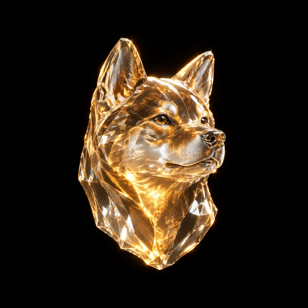
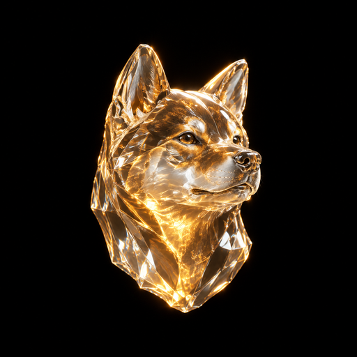
- Keep clear space around the mark of at least a quarter of its width.
- Do not recolor, stretch, outline or add effects to it.
- Place it on dark, calm backgrounds. Busy photos hide the glass.
- Do not use the mark to suggest that we endorse a coin.
Color
One accent, amber, on a near black canvas. Fills are flat; depth comes from blur and light edges, never from gradients. Amber marks actions and emphasis, so use it sparingly.
Type
Geist for everything, set tight and large for headlines. Geist Mono for addresses, amounts and code.
The name
| Use | Write it as |
|---|---|
| Full name | IAM NOW UTILITY, in capitals. |
| Said aloud and in headlines | I am Now Utility. In display type, the I, N and U are amber. |
| Short brand word | INU |
| Our token | $INU, with the dollar sign, only for our own token. |
Avoid
- Mixed forms such as “Iam Now Utility”, “I.A.M.” or “IAMNOW”.
- Anything that suggests we are pump.fun, StonkFun, Raydium, Meteora or Jupiter. IAM NOW UTILITY is independent software.
- Emoji next to the name.